Get your free personalized podcast brief
We scan new podcasts and send you the top 5 insights daily.
A product's package must serve two distinct audiences. The front is for the 'shopper' in the store, designed to grab attention and create appeal. The back is for the 'consumer' at home, providing instructions and ingredients. Brands often fail by confusing these two separate communication jobs.

Related Insights
Hint's marketing SVP argues that packaging is the number one source of impressions for a CPG brand, more than any paid media. It's a walking billboard that people see most often. Therefore, it requires significant investment to ensure it perfectly represents the brand's energy and converts on the shelf.

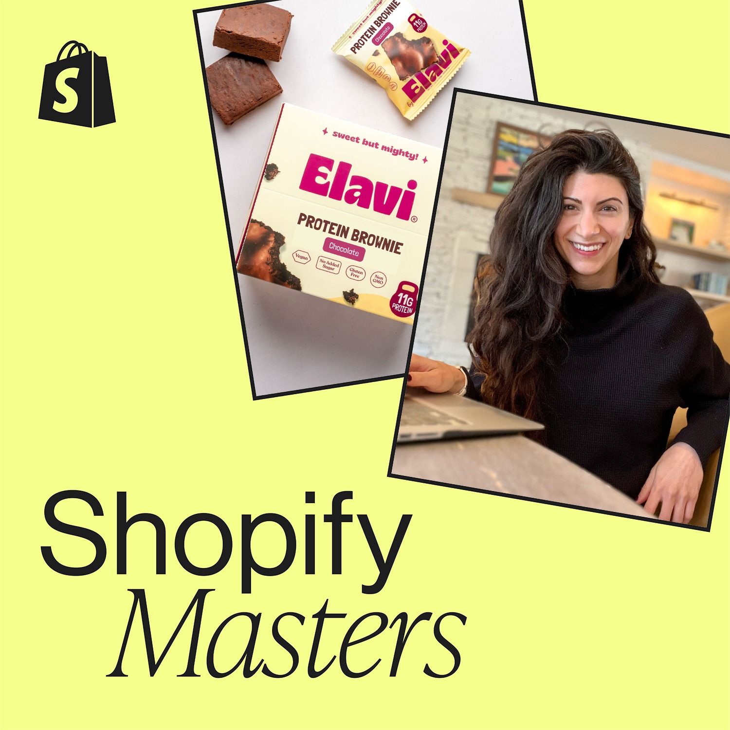
Alave made a bold packaging decision: making the product type (“Protein Brownie”) the main focus, not the brand logo. They gambled that in the split-second a customer looks at a shelf, clearly communicating *what* the product is proves more effective for a new brand than establishing *who* they are. The strategy crushed.
In crowded retail, packaging is the primary salesperson. Brands like RXBAR won by clearly stating value props (macros, simple ingredients) on the front. A new brand must do the same, highlighting key benefits like "slow burning energy" or "clean carbs" to capture attention instantly.
Peripheral vision, which is primitive and subconscious, cannot read words but responds to shapes and colors. These elements should grab a shopper's attention, drawing their sharp, focused foveal vision to read the specific details of an offer on the packaging or price tag.
Consumers are trained by food packaging to look for simple, bold 'macros' (e.g., '7g Protein,' 'Gluten-Free'). Applying this concept to non-food items by clearly stating key attributes ('Chemical-Free,' 'Plant-Based') on the packaging can rapidly educate consumers at the point of purchase and differentiate the product.
Founder Jim Cregan's core philosophy is that a product's success hinges on three elements working in perfect harmony: branding (what it says), packaging (how it feels), and ingredients (how it tastes). If one of these pillars is weak, the entire product fails.
The D2C growth model is plateauing, forcing brands into retail. This demands a strategic packaging shift. Information once on a Product Detail Page (PDP), like macro counts and ingredients, must move from the 'back of pack' to the front to make products 'shoppable' on a physical shelf.

In an age of information overload, the most effective marketing is extreme simplicity. A brand's ability to instantly communicate its core value on a crowded retail shelf is the key differentiator for winning consumer attention. Achieving this simplicity is a complex strategic task.

The cardboard box a product sits in on the shelf (SRP) is a crucial communication touchpoint. This marketing opportunity is often wasted because procurement departments manage its design with a focus on cost savings, not communication impact.
To stand out in the crowded snack aisle, MadeGood hired a design firm specializing in cosmetics, not food. This led to unconventional choices like bright colors and a massive logo taking up half the package, creating a visually disruptive product that grabbed consumer attention.