Get your free personalized podcast brief
We scan new podcasts and send you the top 5 insights daily.
Van Leeuwen’s growth exploded after assigning a unique, solid color to each pint flavor. While individual pints look distinct, together they create a powerful 'rainbow' effect on the shelf, grabbing consumer attention far more effectively than a uniform brand design. They designed an orchestra, not a soloist.

Related Insights
A market can seem established, but if existing products are visually unappealing and fail to create an emotional connection, a new entrant can win purely on branding and packaging that captures attention and meets a consumer's need state.
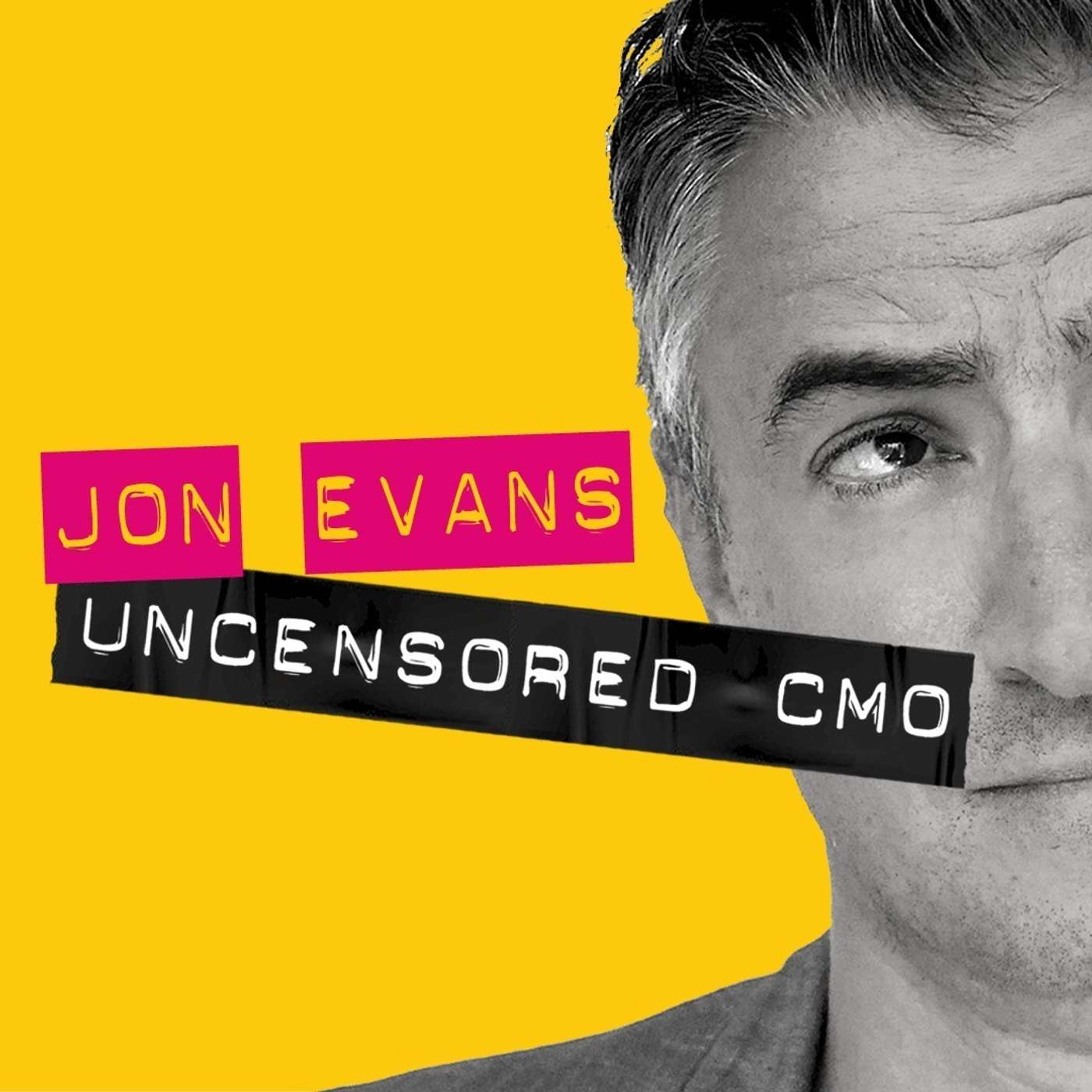
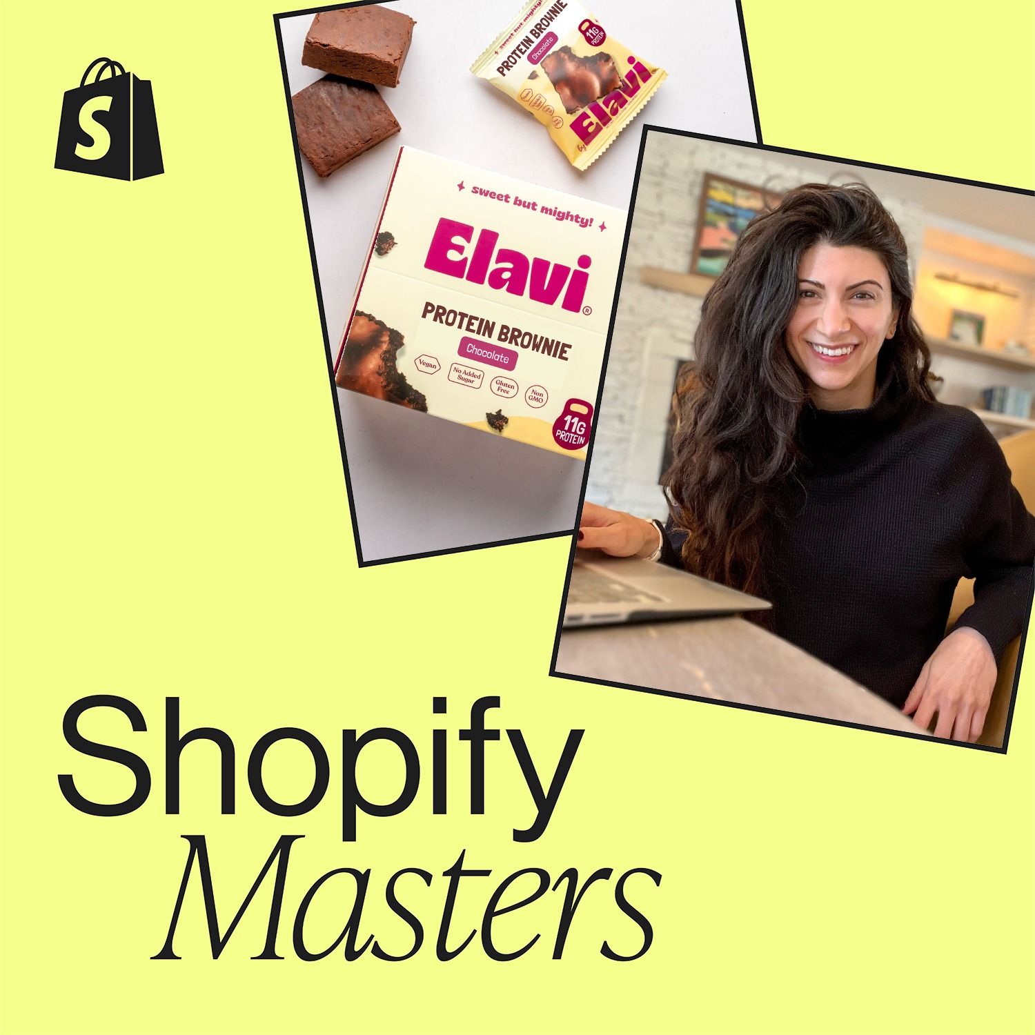
Alave made a bold packaging decision: making the product type (“Protein Brownie”) the main focus, not the brand logo. They gambled that in the split-second a customer looks at a shelf, clearly communicating *what* the product is proves more effective for a new brand than establishing *who* they are. The strategy crushed.
Initially using a standard carton, Matt O'Hayer was inspired by Stonyfield's founder, who pointed out the egg carton was a "big piece of real estate." This insight prompted Vital Farms to redesign its packaging into a piece of art that tells a story, turning a disposable container into their most powerful tool for capturing attention and driving trial purchases.

Packaging can be more than a container; it can be a feature that adds value and novelty. For a CPG brand, this could mean including unique messages, poems, or even personalized fortunes on wrappers, creating a small moment of delight that enhances the customer experience and brand story.
Recognizing that online and retail require different approaches, Grüns executed a major rebrand before its launch in stores. The original branding, created by the founder in Canva, was scrapped for packaging that could communicate the value proposition in the three seconds a customer glances at a shelf.

To break through a "sea of sameness," brands must find their "Pink Batman"—an unexpected, slightly weird element that makes them instantly memorable and distinct, just like imagining the iconic character in a surprising color you can't unsee.

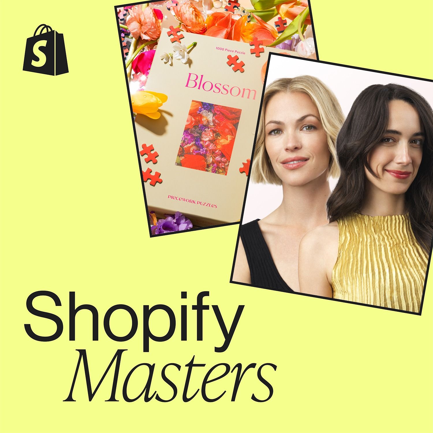
While competitors followed the prevailing minimalist, 'beige-on-beige' aesthetic, Peacework Puzzles deliberately chose a maximalist and colorful brand identity. This contrarian approach made them stand out, resonated authentically with a specific audience, and helped build a loyal following.
In an age of information overload, the most effective marketing is extreme simplicity. A brand's ability to instantly communicate its core value on a crowded retail shelf is the key differentiator for winning consumer attention. Achieving this simplicity is a complex strategic task.

The key inflection point for Justin's Nut Butter wasn't its recipe but its introduction of single-serve pouches. This format innovation unlocked new use cases (hiking, biking), highlighting that packaging and delivery can be more impactful than the core product itself.
The Von Restorff effect states that distinctive items are more memorable. Liquid Death analyzed the water category's conventions (alpine scenes, plastic bottles, serene branding) and broke them all with heavy metal imagery in a can. For a small brand with a minimal budget, this calculated violation of norms created massive distinctiveness and supercharged its impact.
