Get your free personalized podcast brief
We scan new podcasts and send you the top 5 insights daily.
To stand out on crowded shelves, Banza deliberately chose a bright orange box. They observed that nearly every other pasta brand used blue packaging. By using a sharply contrasting color, their product immediately caught the consumer's eye, creating a distinct and memorable brand block.

Related Insights
A market can seem established, but if existing products are visually unappealing and fail to create an emotional connection, a new entrant can win purely on branding and packaging that captures attention and meets a consumer's need state.
Hint's marketing SVP argues that packaging is the number one source of impressions for a CPG brand, more than any paid media. It's a walking billboard that people see most often. Therefore, it requires significant investment to ensure it perfectly represents the brand's energy and converts on the shelf.

In crowded retail, packaging is the primary salesperson. Brands like RXBAR won by clearly stating value props (macros, simple ingredients) on the front. A new brand must do the same, highlighting key benefits like "slow burning energy" or "clean carbs" to capture attention instantly.
To break through a "sea of sameness," brands must find their "Pink Batman"—an unexpected, slightly weird element that makes them instantly memorable and distinct, just like imagining the iconic character in a surprising color you can't unsee.

In cluttered retail environments, pure visual standout is more potent than the marketing message itself. A simple yellow frame around a product boosted sales 150%, and a uniquely colored sign for Stella Artois outperformed standard offers, proving that capturing primal attention is the first and most critical step.

When data suggested a specific mix of flavors for a Costco pack, the founder vetoed it because the can colors clashed. She prioritized a vibrant, on-shelf brand presence over short-term data optimization, believing strong branding builds long-term value.

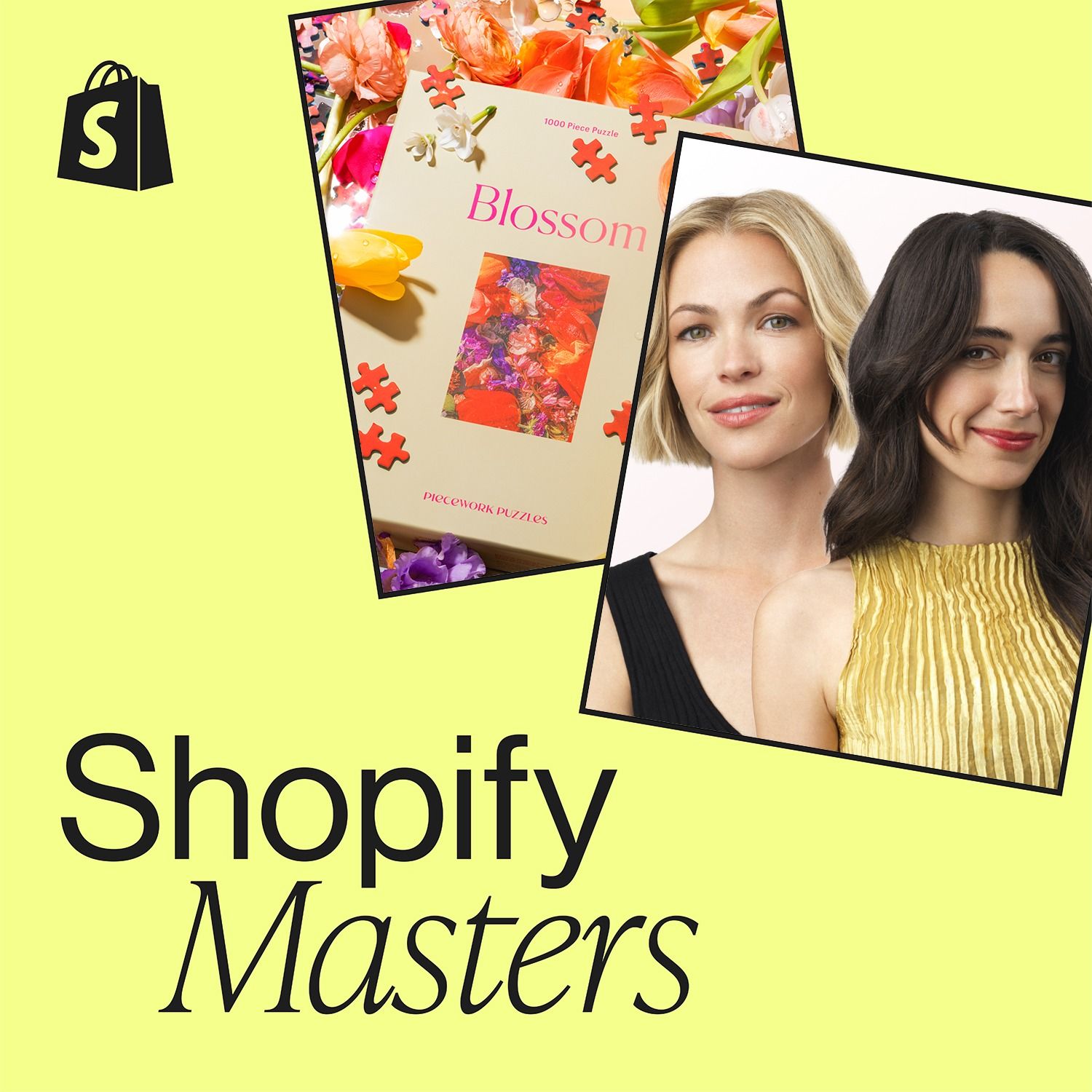
While competitors followed the prevailing minimalist, 'beige-on-beige' aesthetic, Peacework Puzzles deliberately chose a maximalist and colorful brand identity. This contrarian approach made them stand out, resonated authentically with a specific audience, and helped build a loyal following.
In the saturated supplement market dominated by "greens" powders, IM8 leveraged its product's natural red color from beets to create a distinct brand identity. This simple visual cue, from the drink to the packaging, helped them stand out immediately.
To stand out in the crowded snack aisle, MadeGood hired a design firm specializing in cosmetics, not food. This led to unconventional choices like bright colors and a massive logo taking up half the package, creating a visually disruptive product that grabbed consumer attention.
Judy's distinct orange color serves a dual purpose. It helps the brand 'own a color' and stand out in a new market. More critically, the bright hue provides real-world utility, making the emergency kits easy to spot during a crisis. This links branding directly to the product's core function.
