Get your free personalized podcast brief
We scan new podcasts and send you the top 5 insights daily.
Hivemind's branding deliberately courts unsettling themes like the occult, body horror, and paparazzi journalism. This embrace of the "forbidden" and "grotesque" creates a memorable and intriguing brand identity that stands out in a world of safe, sexless design.
Related Insights
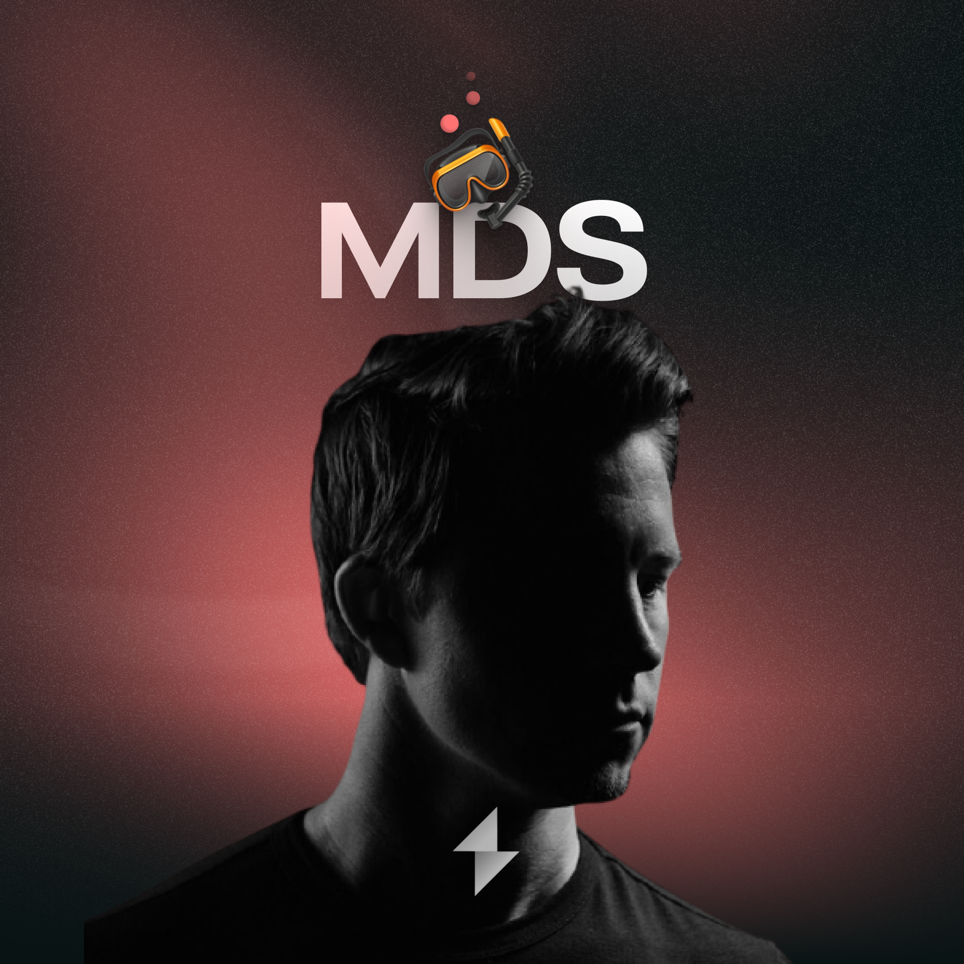
To achieve a creative breakthrough, intentionally explore concepts that are radically different from your established style. Designer MDS created versions that looked nothing like his brand to push boundaries and avoid predictable outcomes before refining his final vision.
In a crowded digital space, products and marketing with a unique, even polarizing, visual style are more likely to capture attention and be memorable than those following standard design trends. Daring to be different visually can be a powerful competitive advantage.
To stand out, brands should adopt assets that are 'meaning-free'—having no logical connection to the product, like Gong's bulldog mascot. This avoids using generic industry symbols (e.g., a fountain pen for a copywriter) and creates a unique, memorable brand identity.

To break through a "sea of sameness," brands must find their "Pink Batman"—an unexpected, slightly weird element that makes them instantly memorable and distinct, just like imagining the iconic character in a surprising color you can't unsee.

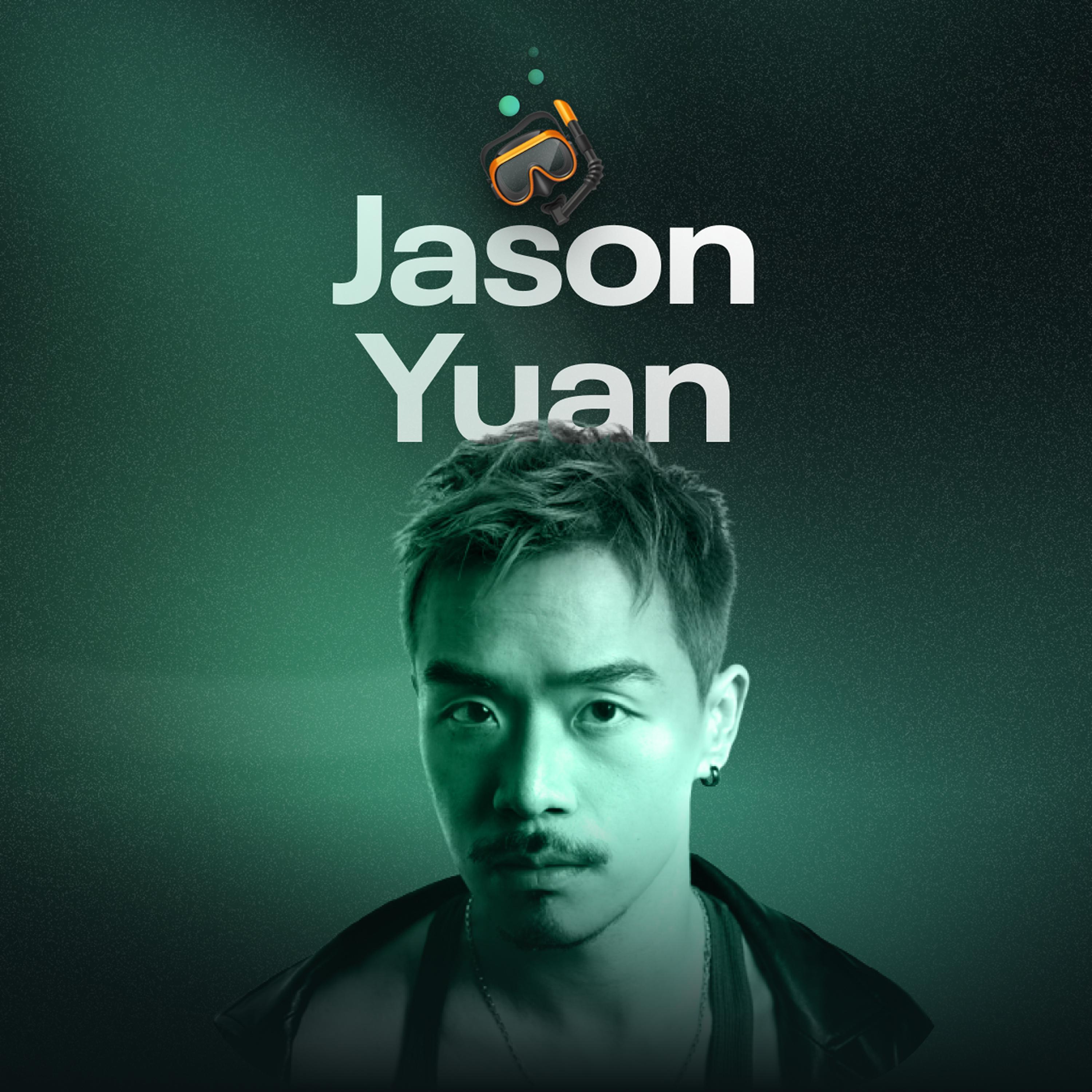
The brand identity for Jason Yuan's products evolved through punctuation. "Dot" used a period to signify a singular, finite memory. "Hivemind" uses an asterisk, which powerfully signifies censorship, footnotes ("more to the story"), and attention—a sophisticated brand evolution built on simple typography.
There is no such thing as a boring brand. A marketer's core function is to find what is uniquely compelling about any product or company and build culture around it. Don't default to tying your brand to external trends; instead, create your own cultural moments.
Before designing Hivemind's logos or UI, the team created its "cinematic universe"—the mood, music, and imagery that defined its essence. This creative world-building wasn't just for branding; it was a method to discover and refine the core product strategy itself.
A brand that tries to please everyone is memorable to no one. To build a truly strong brand, you must be willing to be disliked by some. Intentionally defining who your customer is *not* and creating polarizing content sharpens your identity, fostering a passionate community among those who love what you stand for.

To break through a commoditized market where all banks looked the same, Nubank asked, "what is the most anti-bank color we can come up with?" The choice of purple was designed to evoke passionate responses and signal a complete departure from the traditional banking industry.
To be memorable, avoid brand assets with a direct, logical connection to your industry (e.g., a pen logo for a copywriter). Instead, choose distinctive, "meaning-free" assets (like Gong's bulldog). These unique elements prevent confusion with competitors and create stronger memory associations.